Bookshelves, that is, not your breakfast eggs. Do you stuff books in anywhere there’s room, or do you have a system?
The reason I ask is, I was scrolling Instagram and came across this piece on Bookriot. Seriously, have a look; it’s fun, but make sure you read all the way to the end.
It got me thinking about how I organise my bookshelves – or rather, how I don’t. Yes, I know, I am an utter barbarian. No, I don’t care. Nobody needs to find a book here but me. My one rule about shelving is that series should stay together, regardless of format. That’s it.
You see, when I was but a junior bookworm, I had limited shelf space, but mad Tetris skills. My books were therefore arranged to maximise storage capacity, whilst still keeping the parts of each series in contact with one another. Once I had a house of my own, I had room to ease up on the double-stacking, but other than that, the only nod towards organisation was to keep the fantasy books and general fiction separate.
Then we bought the current house, and installed bookcases with non-adjustable shelves – something of a rookie error. It was further compounded by letting my husband Rob take charge of filling them. Bless his compulsively-organised, neat-freak heart, he chose to shelve the hardcovers and the paperbacks separately, by size.

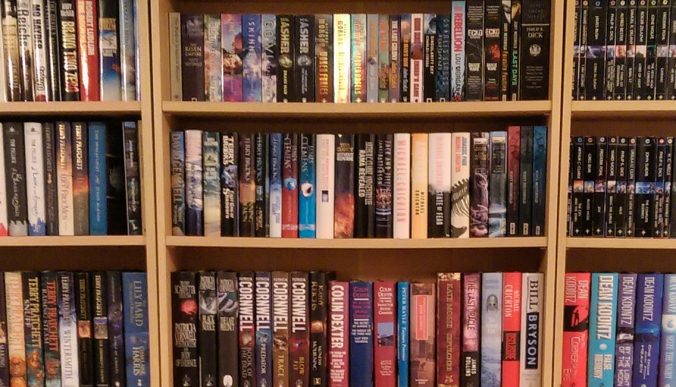
Our bookshelves circa Novermber 2015. My books on the left and middle bookcases, Rob’s on the right.
Yes, it was tidy but . . . Historical fiction was next to spy thrillers. Women’s fiction and memoir were cheek-by-jowl with fantasy. My Pratchetts were split across two bookcases because the first 10 or so are in mass-market softcovers, the rest in hardback – ditto The Wheel of Time. Several other series are in the paperback bookcase but on separate shelves due to a mix of A and B format. And Memory, Sorrow and Thorn, which I have as mass-market, followed by trade paperback, then by hardback, was distributed across bookcases in three different rooms.
Oh boy.
No.

This is the way.
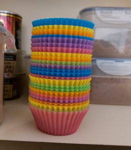
I couldn’t adequately articulate the sheer wrongness of it to me, and Rob didn’t get why it bothered me so much. But then he also doesn’t get why tea-towels must be folded with the printed design on the outside, or why only one of these stacks of silicon muffin cases is correct.
Or am I just weird? On second thoughts, don’t answer that.
As you can probably guess, I will not ever be sorting my books by colour. Unfortunately, neither will I be shelving series together (except those I was able to buy all in the same format), because now that I’ve got used to them, Rob’s way of organising the bookshelves does look very nice.
But if anyone thinks that because of that I treat the books as purely decorative, they’re mistaken. My books are old friends. Every time I look at them I remember our shared adventures. That “photo album” effect is one of the things I miss the most about switching to ebooks. Maybe it’s why the shelf rearrangement bothered me: it shuffled all the familiar pictures around, and changed the narrative. No doubt when we next move house and everything’s boxed/unboxed again, I’ll have the same reaction.
So how do you shelve your books? Alphabetically by author, by genre, by vibes? Does the result have to be aesthetically pleasing, or merely useful?
Just don’t argue with me about the muffin cups, okay?